Search Our Blog!

Friday 25 February 2011

Catch Me If You Can - Title Sequence

So in class we were told about a website called The Art of the Title, which is a 'leading web resource of film and television title design from around the world'. It has a wide variety of different title sequences which I'm already familiar with from my Graphics class (we briefly studied opening sequences). The opening for Catch Me If You Can (2002) is one that has got my attention for a while now. The overall Saul Bass aesthetic and brilliant soundtrack work perfectly together, whilst still getting the necessary information across: the distribution company, DreamWorks, displayed for six seconds; the studios, Splendid Pictures and Kemp Company for three seconds; producer details, 'A Parkes/MacDonald Production', another three seconds; and the director, Steven Spielberg, three seconds again... It is clear that the titles are actually quite fast-paced, and for good reason, as straight away we are immersed in this animated world of silhouettes and peculiar soundtrack that makes this opening even more mysterious. The film title appears 40 seconds in, for six seconds, then we're plunged straight back into the visual depictions of these two silhouettes in different cat and mouse-like chase sequences... Yet everything about these figures' movement is almost casual; it is all very intriguing and visually pleasing – the colours, the pacing...

In technical aspects, we couldn't even begin to think about creating a sequence incorporating this kind of stylistic animation. But if we can take anything away from this example, it's that a combination of subtle and explicit references, with a thought-through audio track, can go a long way to create a sequence that poses questions and gets the viewer thinking about what to expect of the film ahead of them.


Our thriller - Sound

At home, i began searching for music that fitted as a good soundtrack for our thriller. I was looking for something slow pace and sinister yet still quite calming...but then gets a bit disturbing after listening to it for a long time. (I demanded for a lot there, but i actually found a PERFECT song!)...i just uploaded an instrumental version :)

Nine Inch Nails - Something i can never have (instrumental)

I love the contemporary-ness to this song, having just a piano playing is very calming but the rhythm to it gets quite disturbing after a while, the song is emotional as if someone has just died...Lovely! 


There was also an alternative:


Black Dying Rose - Bless the Fall


Now this song was pretty something o_0 ...screamo.
What was great about this song was that it started off contemporary like 'Nine Inch Nails,' it is slow and creates that depressing atmosphere. The calming sound of the piano playing is broken by a laugh followed by SCREAMO (words being shouted out not sung) 
Having heavy metal rock/screamo contrasts against the innocent look our character has, showing her split personality of what she is like at home, isolated.


The Shining - How is suspense created?

If you remember, one of my first blog posts was an analysis of how suspense is created in a scene from What Lies Beneath (see here). This time I'll be analysing three key scenes from the classic horror The Shining (1980), which we watched in class closer to the start of this unit of work. Reactions to the film were mostly positive and we agreed that there were quite a few scenes that stood out that were particularly suspenseful.


The first clip I will talk about is the baseball bat scene, where Wendy discovers the stack of typewritten pages that are covered with the proverb, 'All work and no play makes Jack a dull boy', repeating distressingly over and over. So what makes this scene so effective and suspenseful? It begins with Wendy cautiously walking and, baseball bat in hand, looking around. We can hear her footsteps and the gradual increase of a low chilling soundtrack; 'Jack?' she calls out. Everything about this scene has us in anticipation for what's to come. The camera follows her and is momentarily obscured by a wall of portraits, making us expect something sinister to appear on the other side... She stops. The camera cuts to a mid-close up with her back to the typewriter; slowly she approaches and the shot cuts again. This time we get a really interesting low angle shot looking up from the typewriter as Wendy enters the shot. The music starts getting darker with another shot of the camera directly zooming into the stack of papers. Whilst this should usually be avoided, in this scene it proves quite effective as the impact hits us, emphasizing the fact that Jack has gone mad. She frantically flicks through the pages, all the while we are on the edge of our seats, as Wendy's hysteria grows and grows. The camera cuts to the wall behind her creating an obstruction again, but this time we see the camera inching to the left, as if someone's watching her... all the while we know exactly who it will be.

Next is perhaps the most famous scene from The Shining, which has had significant influence on pop culture. It is none other than the 'Here's Johnny!' scene. This is a short one compared to the other two, but what I thought was significant is how the 180 degree rule is actually broken here. Originally, Jack is on the right of the screen whilst Wendy is on the left behind the door. However, once he starts knocking down the door their positions on the screen switch, creating an intended feeling of disorientation for the viewer that makes the scene even more suspenseful and – dare I say – scary. With each swing of the axe and sound of the shattering door comes Wendy's screams of desperation, which keep us on edge throughout. The close-up of Jack's face through the broken door panels is one that is iconic, and for audiences then might have served as comic relief ('Here's Johnny' was a catchphrase from 'The Tonight Show Starring Johnny Carson', a talk show that aired at the time), as well as further indication of Jack's loss of sanity. All in all, we are anxious to know what will become of Wendy and Danny at the hands of Jack.

Finally, there's the maze scene from towards the end of the film, which was the one that stood out the most for me and genuinely got me on the edge of my seat the most. The clip depicts Danny running from a rampant Jack. The scene is darkly lit, comprising of exterior shots at night. The mise-en-scène here already sets up a brilliant setting for a chilling horror scene. For the majority of the chase scene the two characters' figures are dark silhouettes across the snow which is immediately unnerving, or at least when it comes to Jack who is wielding an axe. As the camera follows Danny running in the maze, it feels very reminiscent of an earlier scene where he is on his tricycle riding through the Overlook Hotel's vast hallways.

 
That scene was another that was particularly suspenseful, creating a feeling of dread as we watched Danny turn the corners not knowing what could lie ahead (not to mention the contrasting sound of the tricycle going over from carpet to bare floor). This time it's different and it is as if the camera is Danny's assailant. As Danny turns the corners we just hope he doesn't come to a dead end... All while this is happening, we get cross cuts of Wendy inside the hotel who runs around manically with a knife (maybe Jack isn't the only crazy one...) and soon finds the dead body of Hallorann – more zooming here that, coupled with the sudden raucous soundtrack, gives a real feeling of shock. There's a few more little scenes of Wendy flailing about the hotel, including her encounters with several 'ghosts', but you know what to expect.

Now I'll end this by declaring that I never want to write about The Shining again, goodnight!


Further reading:
http://www.dareland.com/kubrick.htm – fascinating.
http://adampolselli.com/2008/01/06/stanley-kubricks-editing-in-the-shining/ – analysis of Kubrick's editing in that tricycle scene.

Thursday 24 February 2011

Production Schedule

This is a mock up of our Production Schedule, we hope to stick to the dates and times we would film so that we remain organise. This schedule should be followed in order for the group to finish everything on time before the deadline – stress free. We also hope to finish early so that we could independently improve and update our own blogs.


Wednesday 23 February 2011

LiveType and Soundtrack Pro

When editing our second preliminary film – 'The Encounter' – we had the chance to try out some software used for post-production editing: LiveType and Soundtrack Pro. LiveType enables you to create interesting and customizable title sequences for your film, whilst Soundtrack Pro can be used to edit audio and compose your own music.

Once we had our preliminary film ready in Final Cut Pro, we had to export for either LiveType or Soundtrack Pro from the file menu in order to import the film into each program (after making sure we placed 'in and out' points where we wanted the text or sounds to appear). In LiveType, we went to file > 'place background movie' enabling us to see the film whilst positioning the titles and sounds accurately where we wanted. When we finished experimenting with sound effects in Soundtrack Pro (you can hear the result for the first half of The Encounter) we went to 'submix' and changed it to stereo. Then we went to file > export and chose the output as 'Selected tracks, Busses, and Submixes'.

Soundtrack Pro was fairly straight forward and quite fun to play around with, however, we found LiveType particularly tedious and complicated. Our efforts weren't very good to say the least, so we ended up creating a simple title within Final Cut Pro. All in all, I hope the practice we had here comes in useful for our final thriller opening.

Inspirations for our thriller - Orphan. (Mise en Scene)

Perfect! The Orphan is a very thrilling film. The actress is perfect for such a disturbingly creepy role. The mis en scene is also spot on! The neatly brushed brunette hair tied back into two separate bows and pale complexion of her face adds innocence into her look.


Orphan_movie_image_9.jpg (600×311)

Her outfit is very old fashion and formal, this also adds to her innocence. Her personality can easily be judged upon by the appearance, her whole look makes her seem well behaved and mannered. However knowing as the film is set in the presence, her look becomes quite freaky as its quite dated back to the 20th century and she would come across to people as weird.

In terms of mise en scene, Esther's look (the orphan) would be perfect for the character in our thriller as she too portrays an innocence surface but deep down is quite a troubled child (emotionally).

Inspirations for our thriller - The Lovely Bones

The Lovely Bones.


After researching and discussing with my group about our thriller, we finally decided to go ahead with doing a psychological thriller of our own.
Planning this, i did some independent research on films that could inspire our thriller. I watched 'The Lovely Bones' a while back in the cinema and when we were discussing more in depth on how we should approach our thriller, 'The Lovely Bones' came to my mind, and it was something i just had to share out, it was a good start to our research. I showed my group clips from the film and they agreed to having an interpretation of the lighting, sound and mise en scene - like the scrapbook.


Susie Salmon's murderer kept a scrapbook containing images of her. In this image is a school photo of Susie - her being in her uniform shows the innocence she has. Next to the newspaper print image is a lock of Susie's hair secured onto the scrapbook with cellotape.
My group felt that the scrapbook was very creepy and disturbing to have, which led us to agreeing to have one in our thriller
His previous pages contained sketches of an underground passage (which he built to lower her in and kill her).
The sketch is very neat and well thought out which shows he is very experienced with these things - obvious he has made traps before.
These last three newspaper prints are, cut outs from the newspaper. They contain images and information about the murderer's next victim, Susie's younger sister.
The amount of information that is stored in this scrapbook is very creepy (just what we want!)
Our scrapbook probably wont contain newspaper images and information like the one from the film but it sure will have images of the girl that our 
'creepy' character will stalk. 


Our Interpretations.

This is our own interpretational photographs of the scrapbook containing images of our victim.
The scrapbook is mine - which i found at the back of my cupboard. As i do art, i bought this scrapbook for chalk drawing but i never got to draw on it. When we were looking for a scrapbook I knew this one would be perfect as it looks very personal and ancient, which creates a sense of mystery. Also the inside pages are black which adds to the dark secret - like feeling.
The following four images are the victim, these images came from my friends Facebook profile, she was kind enough and chilled to let me use her as the victim.
These images were just printed off in colour on normal A4 paper then cut down to size and stuck into the scrapbook.


Inspirations for our thriller - Seven (Camera Shots and Effects)


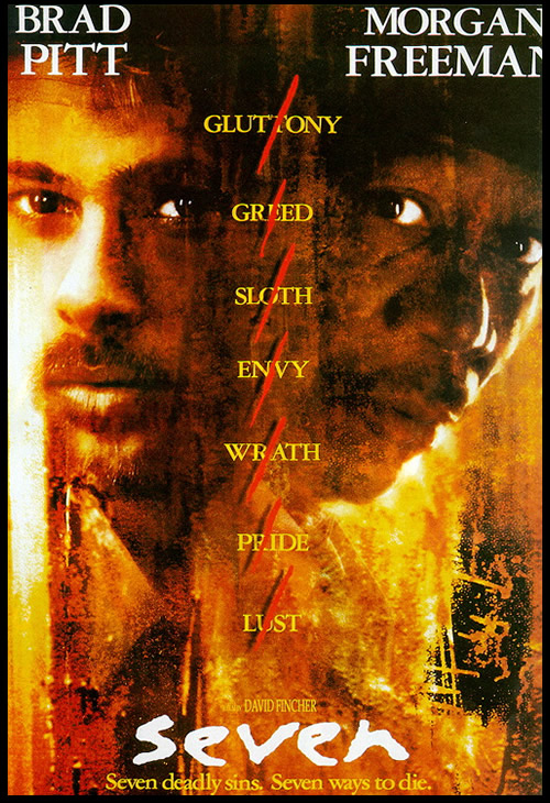
The opening of ‘Seven’ is what got the ideas starting for our thriller, after watching the opening sequence we straight away fell in love with the fast flashy cuts. The opening sequence is very effected due to the confusion it creates for the audience, the intense and discrete opening was achieved by flashy quick shots and the variety of speed.
We also would like to interpret the same sort of outcome, using the flashy cuts and the damaged film effect (like an old fashion camera is being used). These types of effects will contribute to making our thriller be more disturbing.


Inspirations for our thriller - The Stepfather (Sound & Effects)


The stepfather also approached us in an inspirational way, I particularly liked how the discrete opening eventually led to unravelling a big secret where the title sequence ends, leaving the audience in suspense. In the beginning of the title sequence it seems as if the man is having a normal morning, one that he has everyday, however gradually, camera shots of props hint out that he actually killed his family. 
The shots that were most inspring were the bird's eye view of the neatly aligned beauty appliances and toiletries like the electric shaver and cutting scissors. The neatness is very OCD like, which can be quite disturbing at times - normally overly perfected things can seem a bit odd (to some people). We may interpret this into our film, neatly aligning the stationary onto the work desk.
What i also like is the type of song playing in the background, we gather information straight away that it is Christmas at the time, it is very effective to use such sweet peace making music in a scene which also shows camera shots of his dead family, murder weapons and even a flash back of an innocence girl screaming right before he kills her. This is dramatically contrasted with the music which is what i would love to interpret into our thriller. As the character in our thriller is a quiet neat freak school girl we'll have this contrasted with her listening to heavy metal rock which will instantly take away her innocence once heard.
I would also love to add a flash back scene of Lili (the victim) having a laugh with her friends to show that on her surface she is a happy popular person. 

The contrast between the neatly aligned beauty tools with the dumped murder tools in the sink is VERY effective! I love it!!!

Tuesday 22 February 2011

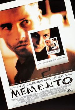
Memento Review

Last night I watched the thriller film Memento (2000) by Christopher Nolan, the title sequence of which we studied in class. I kept coming across this film online so I decided to finally watch it after reading good things about it, and thought it would be a great opportunity to watch another thriller with the context of our Media Studies work in mind (the first being The Shining, which I will talk about specifically in my next blog post).

The film begins with a blank screen with titles rolling over it. A short narrative opening follows, which is played backwards. I thought this was really effective as it immediately intrigues the audience, especially since the scene that is played backwards portrays the story's ending. This reminded me of the 'Watching: Beginnings' documentary we saw a while ago which told us how a 'favourite trick of film noir, as observed in the 1995 film 'Casino', is to begin a film with the ending' (see my blog post about it here). This in turn also brought to mind a negative review I read of the film that states: 'Nolan uses the structure simply as a gimmick to refresh a stale story of revenge, crime, sex, a film noir that never gets any darker than gris.' (Stanley Kauffmann, New Republic). I thought this was an unfair judgment; maybe the overall premise of the film (man hunts for a criminal he believes killed his wife) isn't very original, but in what other film does that man suffer from short-term memory loss and use notes and tattoos to find the killer? This is what for the most part made the main character of this film so interesting and got us to emphasize with him, even until the surprise end of the film; which brings us to the structure of the film that was also mentioned in Kauffman's review.


The story is told in a non-linear format, with two separate narratives – one in colour and one in black and white – that alternate and finally come together during the final events of the film. The black and white sequences are shown normally enough, but it is the colour scenes that depict the main character Leonard's investigation in reverse chronological order. What is so effective (and so-called 'gimmicky') about this narrative device is that, like Leonard,we do not know of what happened before the current scene, which lets us further emphasize with his condition as we also feel confused. It is this confusion that makes the viewer want to carry on watching, but for different reasons to your typical film, as Nolan gets us to want to know what led up to what we've already seen (primarily the killing of Teddy, but also the photographs Leonard has taken of things we have not seen yet, and aspects of the film such as the broken window of the Jaguar and the pickup truck outside the dilapidated building, all of which only bringing about questions for the viewer), and provides a shock twist that makes us realize that what we saw in the beginning of the film wasn't as significant as the reasons behind it (phew, that was a wordy sentence). This altogether was achieved by giving the audience the clues needed to figure out the narrative, whilst helping us to understand the order of events. For example, the colour sequences shortly overlap with each other to depict that they are not in chronological order. However, with all these clues helping the viewer to get a sense of what's going on (and in turn making them feel absorbed by the narrative and involved), Memento is still the kind of film that requires your full concentration (and, like quite a few thrillers, the kind that you should watch more than once).  

The convergence of the two narratives is depicted with the help of 
the developing photo
One thing that kind of bugged me was the unreliability of some aspects of the narrative. I won't give too much away, but it reminded me of another film where the audience is tricked into believing one thing, but then revealing that what we saw was a hallucination. This isn't exactly what happened in Memento, but the – erm – 'big reveal' was executed much better without that feeling of being tricked for no purpose.

It would be brilliant to bring in some inspiration from Memento into our thriller opening. I think some backwards-played shots could be really intriguing aspects to include in the opening. Another possible source of inspiration is the fact that Memento revolves around the use of two seperate narratives; however, it would be inappropriate for us to include something like that as we are only creating an opening that should only be about a couple of minutes long. A more plausible idea would be to start the opening with the end of the story – like in Memento (and Casino) – but we've already planned what will happen in our opening and, due to time restrictions, it wouldn't be ideal to start changing our minds.


Further reading:
http://dinamico2.unibg.it/fa/fa_mem01.html – interesting article by Stefano Ghislotti for 'Film Anthology'.
http://www.rottentomatoes.com/m/memento/comments.php?reviewid=210692 – extract from that silly review plus some great comments arguing against it.

Monday 21 February 2011

Introduction to Editing

We first had the opportunity to edit together clips we filmed ourselves for our first practice film (which you can see here). This was quite exciting as it was some of the first practical work we did. For the editing we got to familiarize ourselves with Final Cut Pro, which is, for the most part, quite a daunting piece of software to first look at. However, I had no doubt that once I got to edit a few more times it would all come much easier.

In this instance we were taught the basics, such as how to import the clips we filmed into the program, by going to File then Import. Then we could review the imported clips in the browser, and, by dragging the desired clips to the timeline, shorten them to the required length. We can also position the different clips anywhere on the timeline by dragging the clips around. This was all easy enough to get the hang of, and once I learnt to use the razor blade tool to split a clip in two (allowing me to position another clip in between), we soon completed our first editing session!

Font Analysis

In this lesson we focused on the different kind of fonts presented to us in film posters and Title sequences etc. we were told that the fonts we use must match the our film openings. For example if its a horror film then the font used will be all drippy and look like blood is dripping. the font has an affect on the audience ; as soon as they see it they'll know that its going to be scary!
Fonts can be split into Serif and Sans-serif


Fonts such as 'times new romans' are known as Serif fonts, they've got a 'tail' at the end. Serif fonts are said to be more formal than sans serif fonts and are more old fashioned.
Sans Serif fonts such as 'Verdana' are tail-less. Sans, which means without in French. Therefore these type of fonts are 'without-serifs'.

Sans serif  (verdana) & Serif (Times New Roman)


There were two different film posters that we looked at, these were of ROCKY and PEARL HARBOR.

This is a font called 'palatino' which is a serif font
; hence the tails at the bottom of the letters.The serif type of fonts are said to be
 old fashioned so this can hint to us that this film contains historical features e.g.
about war etc.


This is a font called 'franklin Gothic heavy' it suits
the title and colours used as a Rock is solid and black and white are both solid colours. Its a Sans serif font....many of these fonts are used for titles e.g. this one. this kind of font really stands out as it is just so BOLD!

Card Game Edit

After we had filmed all the clips for our card game scene ; the following lesson we had to edit it and put all the clips together. we thought we had enough shots however when it came to editing we had to take some of the shots out as they didn't fit in well, this left us with only a few shots. we re-used one main shot more than once.
                  in order to view all our shots we put it onto final cut pro, we were then able to select and delete shots that were unnecessary. we were also able to make shots shorter as most were too long. Final cut pro allows you to add effects and titles. we didn't have time to do this but we will be doing it for our final piece. 
By editing this short Card game sequence I was able to get used to using final cut pro and I can use this new skill to edit our final piece. 


<<<Clip used more than once 


<<< Final Cut Pro


Friday 18 February 2011

The Pitch


For the past couple of weeks we have been working on developing the ideas for our thriller opening. Today we presented to the rest of the class the pitch for it. We started working on the presentation in Wednesday's lesson, unfortunately with two group members missing (Charlene and Wala). However, we pulled together to do as much as we could in class today before we had to present. In the end it went pretty good!

Tuesday 15 February 2011

Preliminary Film - Evaluation

Our preliminary film - working title: The Encounter - can be seen here.


"A character opens a door, walks into a room, sits down opposite another character and they share a few lines of dialogue"

Our brief was to film the above scenario, making sure to utilize at least one match cut, an example of shot/reverse shot, and to show understanding of the 180 degree rule.

To plan our preliminary film, we created an 'animatic' storyboard using jelly babies (that can be seen here), taking photos of different possible shots we would re-create in the actual film. However, our original idea ended up being too complicated (many unnecessary characters, plus we didn't pay attention to the actual brief...) thus, when it came to film we thought on our feet and changed the story to fit the brief. So let's get down to some evaluating...

Example of match cut

A match cut is the editing of two shots together where the actions in the shots link together, creating a continuous flow between the shots. Initially we actually didn't include a match cut, however, we finished shooting early so we went back to take some additional shots. We easily filmed a close up of my hand opening the door which was added to the original take. Match cut: check!

Example of shot/reverse shot
Brilliant filming by yours truly...
A shot/reverse shot is a technique in which the camera position of the shots give a sense of conversation between two characters. This can be observed in the example to the right from the 1992 film Light Sleeper. So what about in our preliminary film? Well... we did opt for a great point-of view shot, in which either I'm tilting my head or the so-called common room was built on a slant... (see photo above). Shot/reverse shot: unsuccessful.

The 180 degree rule is a simple guideline when filming: the subjects in the same scene should always retain the the same left/right positioning to each other. At first it can be quite difficult to understand, but when filming, you must imagine an invisible line that connects the subjects. The camera must always remain on one side. If it crosses this imaginary line, it will disorient the viewer as the subjects have suddenly switched positions. However, you can actually cross this line if necessary, as long as you show the camera movement doing this. So in our preliminary film we had to show our understanding of the 180 degree rule simply by not breaking it! Simple enough, right? Well, 'on set', it was a different matter, because even with the 180 degree rule lingering on my mind, we still broke it unawarely. It was only until we got to editing that I realized our mistake. 180 degree rule: unsuccessful.

Visualization of the 180 degree rule

So basically our preliminary film was pretty crap. But! – and I'll speak for myself here – by making these mistakes it has allowed me to gain greater understanding of the shot/reverse shot and 180 degree rule. It's one thing being told about it in class, and another to go out and actually do it. I think this preliminary exercise has proved useful and will hopefully enable us to not make the same mistakes in our final film!

Monday 7 February 2011

Thriler Audiences: Who are the consumers?

It is important to look into just who the audiences of thrillers are and which of these we want to target our thriller opening towards. We researched some statistics for films released in the UK in 2009 and looked into gender demographics for different types of thrillers.

Gender demographics
Sci-fi, crime and action films are geared more towards males, whilst for females it is romance, period and suspense films. Horror and comedy films tend to be more in the middle and widespread.

UK Cinema-going in 2009
• In total, 501 films were released, 31 of which fell under the suspense or thriller category...
• Action, comedy, and animation films accounted for 52% of the total box office gross. So why are these genres so popular? Well as mentioned earlier, comedy films appeal to a wide audience of both males and females. Similarly, animation films are generally suitable for all ages and so are family favourites, whilst action films are big summer blockbusters again and again.
• In comparison, suspense/thriller films contributed a mere 4%, which I thought was quite a surprise. I think that maybe thrillers just don't appeal to as wide a market as other films. For example, in the 'fantasy' genre there were only four films released in 2009; however, they contributed 5.4% of total box office gross, more than that of suspense/thriller films which had 31 films. Could the films' certificates be what's affecting the popularity of thrillers?
 
Thriller certificates
To the right are ten varied examples of thrillers I have chosen somewhat randomly, along with their certificate.  We can see that the majority of these examples have a rating of 15, with a couple of 12 and 18 ratings each. I kind of expected more 12 ratings, but it's obvious that thrillers generally have a more mature audience than say animation or even comedy films. With this in mind it is no surprise then that thrillers don't gross as much, so I guess under 18's form a larger portion of movie-goers than I originally thought. (That or thrillers just suck... only kidding!)

Wednesday 2 February 2011

Practice Film #1


This is our first practice film, based on the brief: 'a thrilling game of cards'.

Tuesday 1 February 2011

Structures of Thriller Openings

There are three basic structures when it comes to the opening titles of a thriller:

A blank screen with titles rolling over it, followed by narrative opening
We observed two examples of films that utilized this in class: Dead Calm (1989) and Donnie Darko (2001). Whilst visually not very interesting (white simple serif font over black background), I thought that the audio in the opening for Dead Calm contributed a lot. The segue between the increasing, disturbing soundtrack and the narrative of the passing train was very effective. Donnie Darko's opening is also slow but mysterious. It creates intrigue through setting, character and choice of soundtrack, although this is ruined by the somewhat shoddy choice of typeface (see The Shining).  

Titles running over a narrative opening
 This is another common structure, although the choice of titles here are probably even more important as we wouldn't want them to distract from the narrative. One example where this was used to great effect is that of Panic Room (2002). The shots in this opening couldn't be more simple basic - simple shots of the city that represent the setting. However, the visually interesting three-dimensional titles add something that is perhaps quite sinister; there is something almost unnerving about these big letters suspended in mid-air, looming over the city.

Then there's the opening of The Shining, which I've already talked a bit about in my response to the Watching: Beginnings documentary. In what otherwise is an effectively uneasy opening that portrays the isolated surroundings of the setting, is the monstrosity that is the ugly cyan lettering scrolling up over the image in what could easily be recreated in Windows Movie Maker or such amateur editing software. Awful. It is just another reminder of the importance of font choice, as upon first viewing this pretty much broke any suspense that was building up for me whilst watching.

Discrete title sequence
These title sequences are usually heavily-edited and are separate from the film's narrative. This type of opening can be exciting and effective for conveying a certain mood or effect. The famous title sequence of Se7en (1995) is a prime example of this. Another is Enemy of the State (1998), which combines grainy, CCTV-style footage, with distorted transitions and fast-forwarded sequences to create a thrilling fast-paced opening.


Stylized editing
Because of the stylistic approach to the editing of these title sequences, their creation are often more time-consuming than the regular more basic approaches. However, when done right, they can add a lot to a film. One example is the French film 'Mesrine: L'instinct de mort' (2008), which utilizes split-screen effects of different shots of the same scene to create a tense atmosphere.